Artist Research.
Margarita Kareva
Margarita Kareva is a Russian photographer who uses props, prospective and editing to create imaginative images to resemble fairy-tale and fantasy. Kareva bases her photographs on witches and princesses and finds her inspiration in fantasy books. This surreal photography influences me in order to create similar images in my future work, as I would like to create images which explore ways to include fairy-tale stories. In my opinion, Margarita Kareva's photography is strong and inspiring as it includes the prospective of the photo as well as editing skills which makes the end result extremely powerful.
Kirsty Mitchell.
Kirsty Mitchell is another surreal photographer from Britain, who works with fairy-tale and fantasy. Before working with photography, Mitchell worked for the well known designer Karen Millen, which allowed her to explore texture and manipulation of materials. This can be seen in her work, however, she now works with nature as well as materials to create beautiful images of women, in a way bonded with nature. I really like her work as I believe it shows the beauty of nature in very creative way.


Christopher McKenney.
Christopher McKenney is a photographer who works with surreal, and rather disturbing photography, exploring different types of 'nightmares' and horrors. Created to "express himself," the artists leaves the photographs unexplained for the purpose of his audience perceiving it in their own ways, giving them an understanding of it which means something to them. I really like what Christopher McKenny does in his work, for example, in the photograph "empty" as many of his others show, the faces of his models are completely covered which creates a very uneasy image, and as quoted in an interview with McKenny, “I don’t like to give people an identity; I like to focus on the story, not the person.” which I believe is very powerful.


Worst Photo.

|
In my opinion, the image 'Visitor' is Christopher McKenney's worst photo as I don't believe it has much of a powerful story in comparison to others of his photos. Although the composition is well thought through, I think that he has more potential that what is shown in this image. Personally, I prefer his images which are more obviously edited as they have a haunting effect on the audience.
|
Best Photo.
This is one of my favourite images of Christopher McKenney's as I believe it gives a very different perspective of things and links to the theme 'Dreams and Nightmares'
Lissy Laricchia.


Lissy Laricchia is an artist who works with surreal photography with themes of fantasy and dreams and nightmares.
My Photo-shoots.
Shoot One.
Planning.
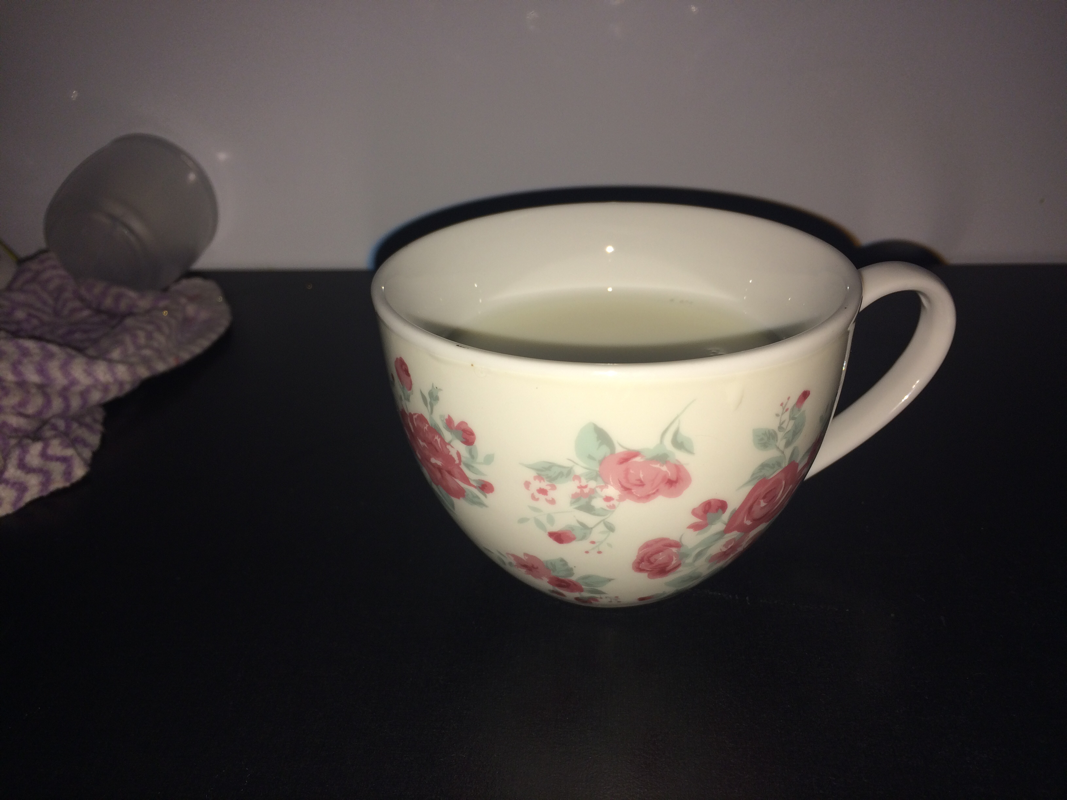
In my first shoot, I plan to use the theme of 'dreams and nightmares' to inspire my shoot. I wanted to create an image of a tea-party in hell with hands coming out of a teacup. I wanted to create an image inspired by Christopher McKenny as his art is so beautiful and well edited I am going to do this by taking photos of a teacup filled with milk so it is white , therefore representing innocence and purity, and then taking pictures of hands in peculiar, almost deformed, positions to represent demons and how they can corrupt something which is pure and beautiful and be able to turn it bad. After this, I will edit the hands so they look as if they are emerging from the liquid. Additionally, I may add a dark tone to the photo to make it more disturbing and make it appear more dark and sinister, relating to the theme of nightmares even more. I will also edit the teacup by using a darker image to replace the pattern, giving a more sinister atmosphere.
The Shoot.


Editing.


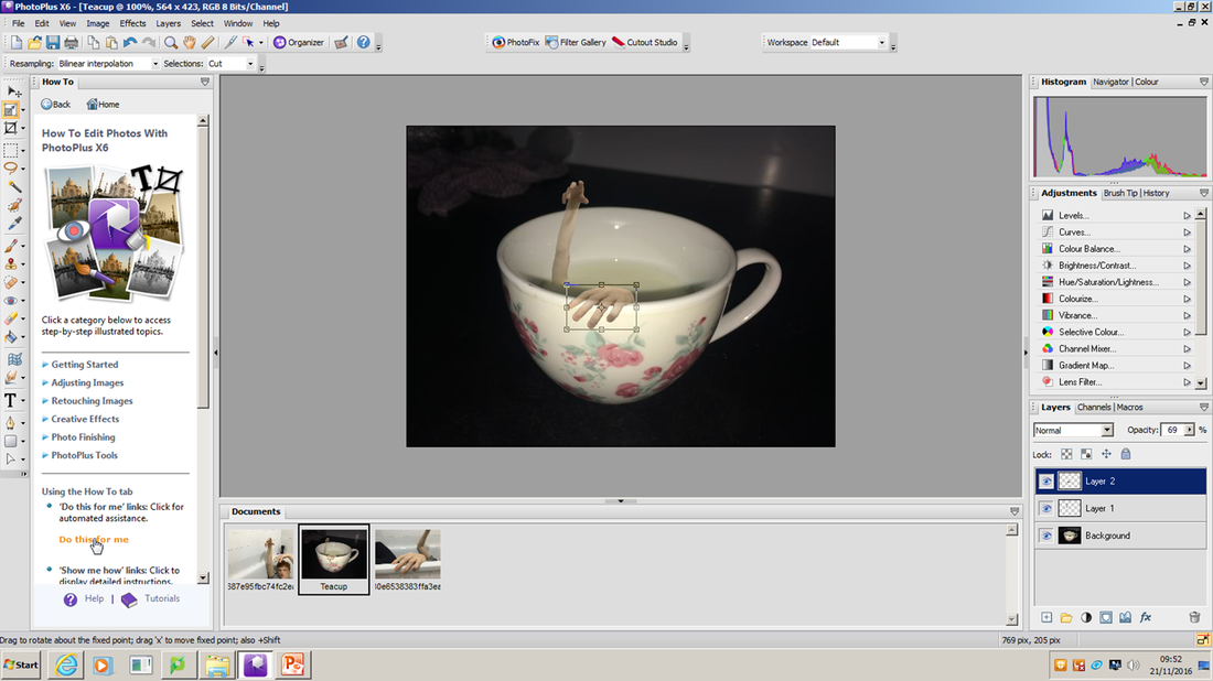


In the process of editing these photos and being able to merge the photos together, I had to carefully cut out images of the arms which I realised was extremely difficult as the colour of the skin was quite similar to the colour of the walls which meant that using the magnetic selection tool on PhotoPlus became extremely difficult, therefore, I had to neaten this up quite a lot with the freehand selection tool.
Final Image...

Shoot Two.
Planning.
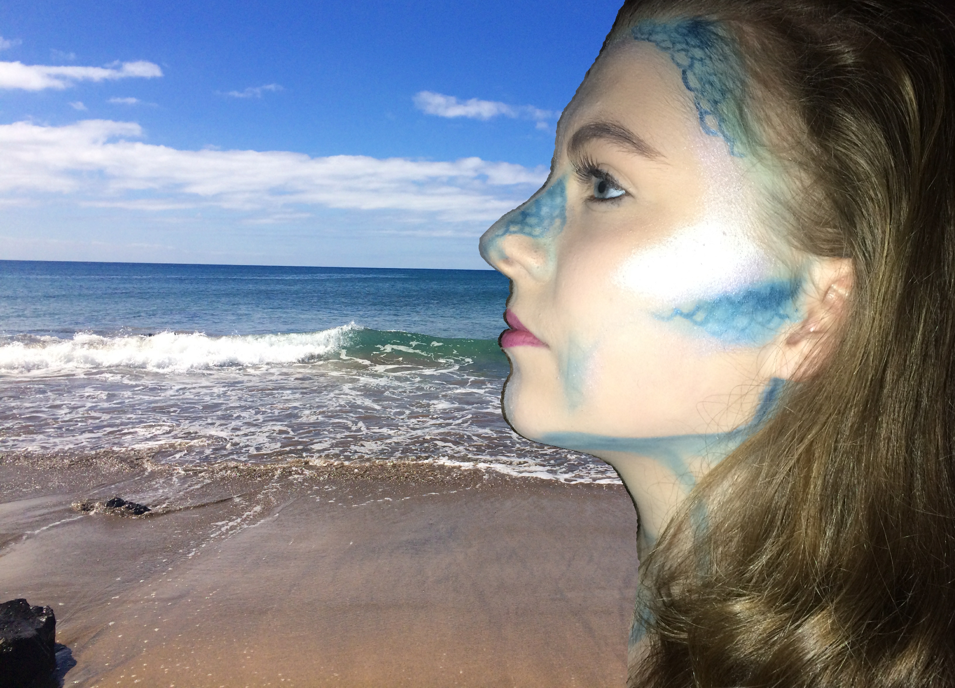
For my second shoot, I decided to create an image inspired by Margarita Kareva as I wanted to use the theme fairytales. I decided to use makeup and perspective to create a mermaid washed ashore. I decided to do this by doing the makeup of my model with scales for contour and in blue, and use the image of her with a background of a beach. As I could not photograph a beach, I used an image that I had taken a while ago.
The Shoot.


Editing.


The Final Image.
Shoot Three.


Editing.


Final Image.
Shoot Four.
Planning.
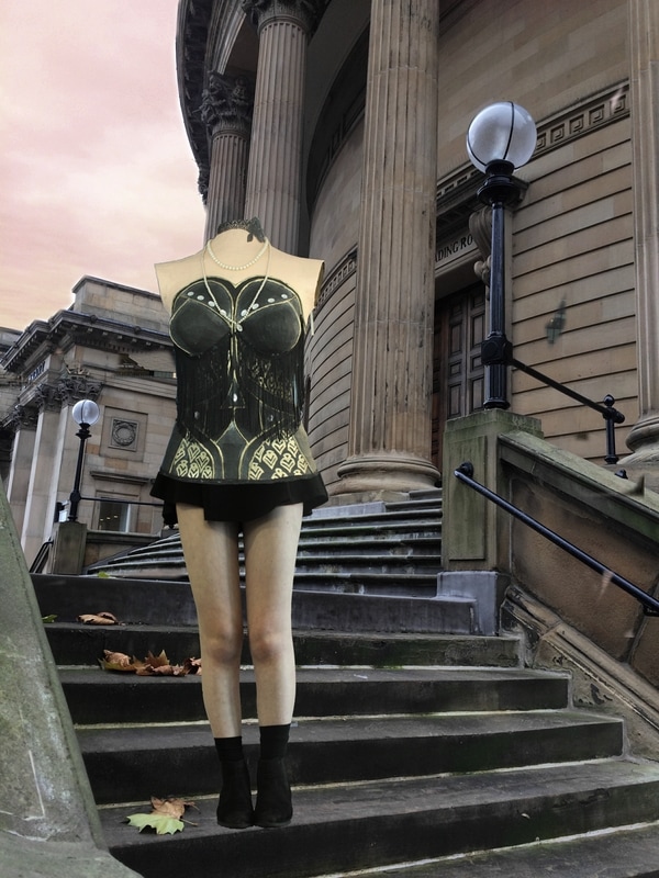
In this shoot, I used an image by Lissy Lariccha to inspire my work to fit the themes dreams and nightmares and fantasy. I want to use a mannequin, to create a broken doll like image, however, I will edit human legs onto the image to show the contast between reality and surrealism. I liked the way the image of Laricchia's did not have a head, and therefore, no identity, much like Christopher McKenney's work, which is why I want to re-create this.
The Shoot.


Editing.


Shoot Six.
Planning.
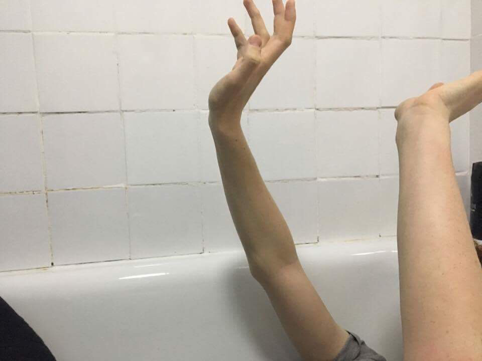
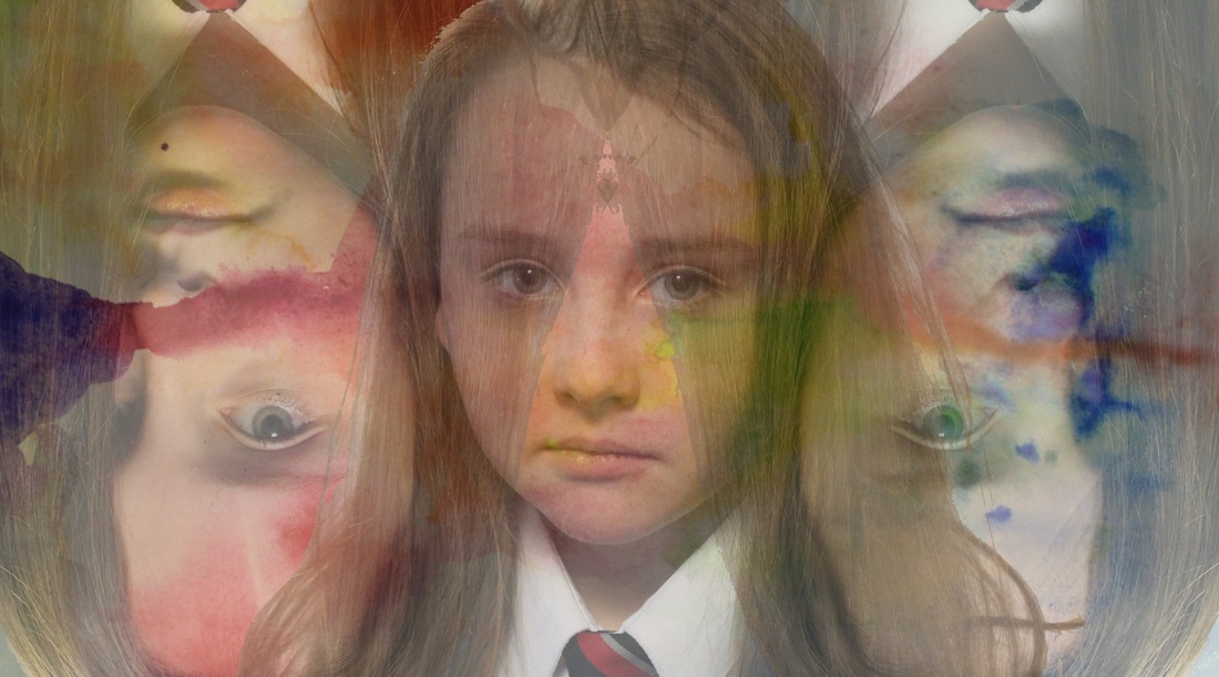
For this shoot, I wanted to recreate an image of Lissy Laricchia's, however, change it in my own way. The shoot should link to the theme dreams and nightmares. I wanted to show an image of an eye however, I want the eye to be on the inside of someones arms to give the impression that someone is always watching. I decided that the way I wanted to do this was to have a body without an identity to represent society and how unknown figures can make us uncomfortable and affect our lives. This links to dreams and nightmares as I want to show how the reality of our lives and how being observed can actually become quite terrifying.
The Shoot.


In the shoot, I used the aperture F15 for the body so that I could get the whole body in focus. I also decided part way through the shoot that I was going to change the white balance to reduce the amount of orange tones caused by the lighting as I wanted the final image to be more dull and gloomy to show the theme of dreams and nightmares. After doing this, I looked through the images that I had taken and decided that I really liked the composition, lighting and aperture of some of the shots. I then moved on to the second part of the shoot where I took photos of the eye. I changed the aperture to F5 to get a more precise image of the eye.
Editing.


To edit this photo, I decided to use the ellipse selection tool on the photo of the eye. After this, I layered the image onto the image of the person, carefully positioning the eye align with the arm. Following this, I zoomed into the eye on the arm, and used the eraser tool to remove parts of the layer that were not necessary, as well as blending the image out by decreasing the opacity of the eraser and making the image look more realistic. Furthermore, I duplicated the layer of the edited eye and flipped the image so that it looked like the right eye.
Final Image.
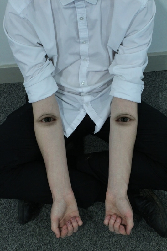
I really like the composition of this photo as it is simplistic however has a strong and powerful representation; however, I felt as if something was missing from the shot and the image did not pull together perfectly. I later decided to use the eyes in the hands of the body instead of the arms, to see if the end result was better. I also decided to use two different images from the shoot as I felt that the exposure of the eye was slightly underexposed in comparison to the photo of the body, in addition to the different image of the body as the hands were a part of the main focus.
Editing.


I edited this photo similarly to my first attempt, I used the Ellipse selection tool to select the eye which I wanted to use, and layering it onto the image of the body and hands. I then aligned the image with the hands, and decreased the opacity of the layer so that I could see where the fingertips were. As I could see where the fingertips would be, I made the fingertips slightly overlap the tear duct as if the hands are pulling the eyes open, I then used the eraser tool to remove sections which were not needed. Continuing this, I decreased the opacity of the eraser tool so and made the edges of the image smoother and made it look more realistic within the hand. After this, I went back to the original image of the eye and flipped it horizontally to make it look like the left eye and repeated the process for the opposite side.
Final Image.
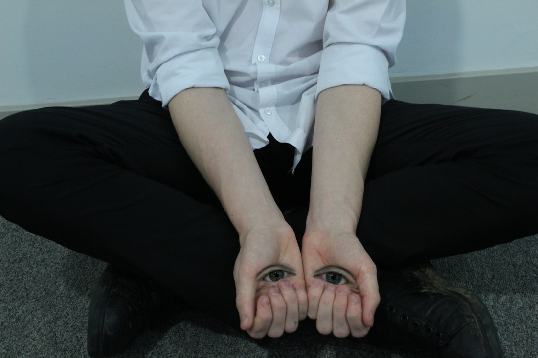
I was much happier with my second attempt of creating this as I feel like it portrays the theme dreams and nightmares better than the first image. As well as this, I prefer the simplicity of this photo as the eyes aren't as noticeable which makes the image more subtle and, in my opinion, more powerful. I also prefer these images merged together more than the first image as the saturation, contrast and brightness fit together better making the photo more natural and realistic. Furthermore, I prefer the exposure of this image as it is dark but bright enough to see everything in the shot.
Shoot Six.
Planning.
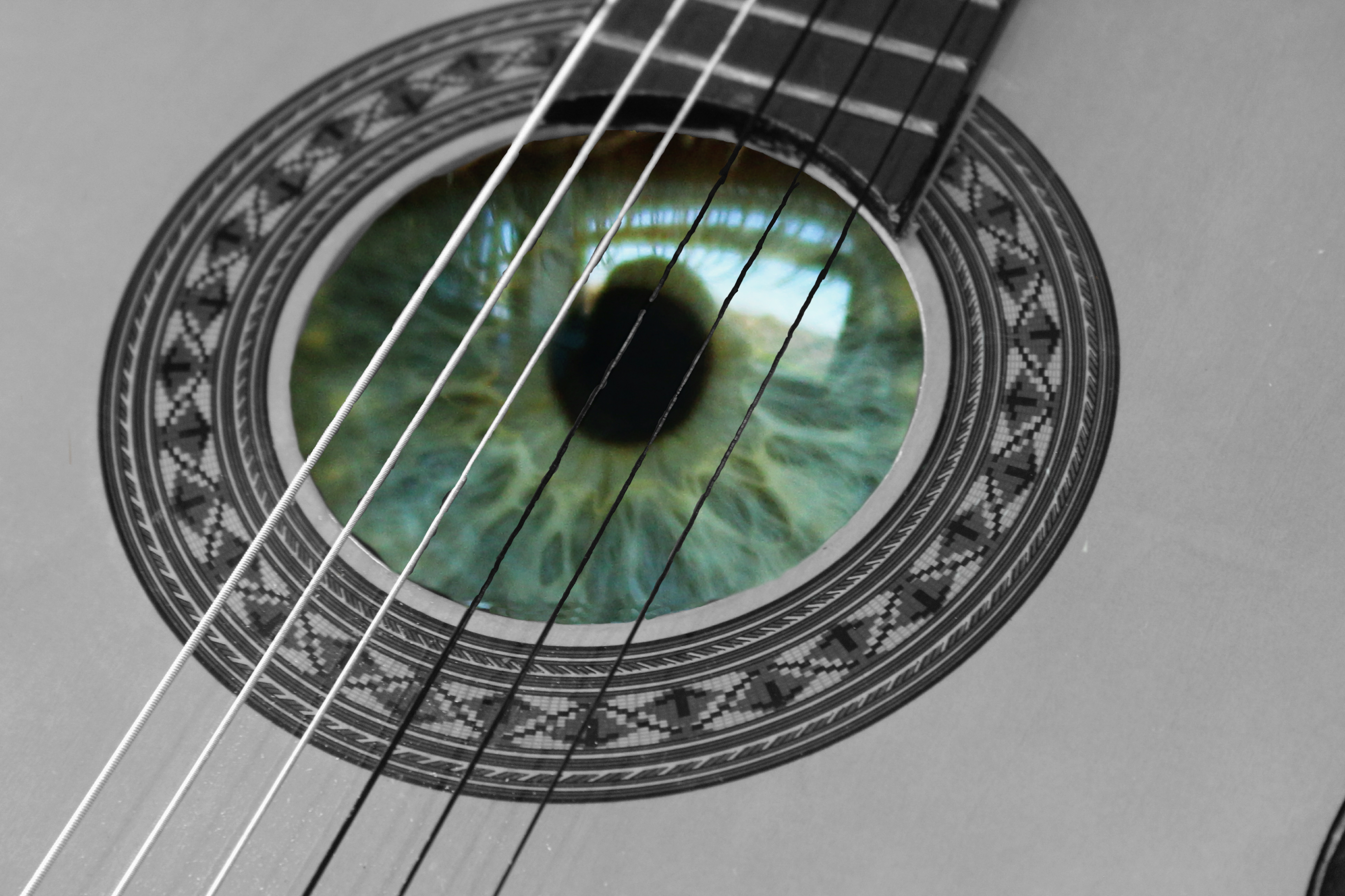
For my third shoot, I used the theme dreams and nightmares as I wanted to create an image of an eye inside the sound hole of an acoustic guitar. This idea was inspired by Christopher McKenny's work as I planned the image to provoke thoughts, emotions and allow the viewer to have their own interpretation of the image. I also wanted the composition to be about everything in the photo and not just a person.
The Shoot.


Editing.


To begin the process of editing, I chose, what I thought was my best photo and began editing, however, I soon realised that the photo I first chose was not focused enough. I then chose a different image which is more focused. Once I had my best photos for the eye an the guitar, I opened both images in PhotoPlus.
After doing this, I used the Freehand Selection tool to select the eye, as the Magnetic Selection Tool was not precise enough. Next, I used the keys ctrl and c to copy the selected area in which wanted to keep. I then used Ctrl L to layer the selected image over the top of the guitar used as a background. Once this was done, I had to re-size the image and move it to the correct size and area. To move on, I then turned the opacity of the layer down so I could see where the image should and shouldn't be. I also had to zoom into the image to see a more definite line of where to keep. After doing this, I used the eraser tool on PhotoPlus to remove the areas I wanted to be seen. These areas included around the guitar sound hole and the strings so that the strings were still visible when the opacity of the eye was turned back to full. This was very difficult because of how thin the stings are however, I was able to do it and make it how I wanted the image to look. After doing this, I selected the background image and used a black and white filter to make the eye more dramatic and noticeable. I feel like this was quite effective and made the photo a lot stronger. However, it was not quite how I wanted the image to look. To perfect the image, I made slight changes to the mid-tones of the colour balance to -9, 9,-9 on my layer, this made the colour of the eye just a slight bit brighter and perfected the colour. After this, I changed the brightness of the layer to 10 and changed the contrast to 35. This made the image a lot more interesting to look at and made the definition of the eye a lot stronger. It also gave the eye a glossier finish. I then decided that the background of the composition did not compliment the eye the way I wanted it to, therefore, I also changed the contrast and brightness of the background so that it was more fitting and looked better with the eye. I changed the brightness to -35 and the contrast to 10. I believe this made the composition perfect in my opinion and it looked how I wanted it to.
After doing this, I used the Freehand Selection tool to select the eye, as the Magnetic Selection Tool was not precise enough. Next, I used the keys ctrl and c to copy the selected area in which wanted to keep. I then used Ctrl L to layer the selected image over the top of the guitar used as a background. Once this was done, I had to re-size the image and move it to the correct size and area. To move on, I then turned the opacity of the layer down so I could see where the image should and shouldn't be. I also had to zoom into the image to see a more definite line of where to keep. After doing this, I used the eraser tool on PhotoPlus to remove the areas I wanted to be seen. These areas included around the guitar sound hole and the strings so that the strings were still visible when the opacity of the eye was turned back to full. This was very difficult because of how thin the stings are however, I was able to do it and make it how I wanted the image to look. After doing this, I selected the background image and used a black and white filter to make the eye more dramatic and noticeable. I feel like this was quite effective and made the photo a lot stronger. However, it was not quite how I wanted the image to look. To perfect the image, I made slight changes to the mid-tones of the colour balance to -9, 9,-9 on my layer, this made the colour of the eye just a slight bit brighter and perfected the colour. After this, I changed the brightness of the layer to 10 and changed the contrast to 35. This made the image a lot more interesting to look at and made the definition of the eye a lot stronger. It also gave the eye a glossier finish. I then decided that the background of the composition did not compliment the eye the way I wanted it to, therefore, I also changed the contrast and brightness of the background so that it was more fitting and looked better with the eye. I changed the brightness to -35 and the contrast to 10. I believe this made the composition perfect in my opinion and it looked how I wanted it to.
The Final Image.