The 'Little People Project.'
Slinkachu’s “Little People Project” began in 2006, he started this to present how living in a big city can make people feel small. He decided to make it a reality by using remodelled miniature train set figures, which he remodelled himself, and setting them up around the city using objects and surroundings and leaving them for people to find after photographing them. He usually takes a photo from far and a few close up shots of the scene. He says “I aim to encourage city-dwellers to be more aware of their surroundings.”

|
|
|
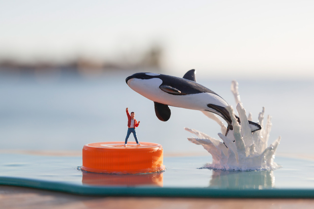
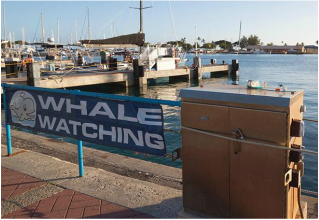
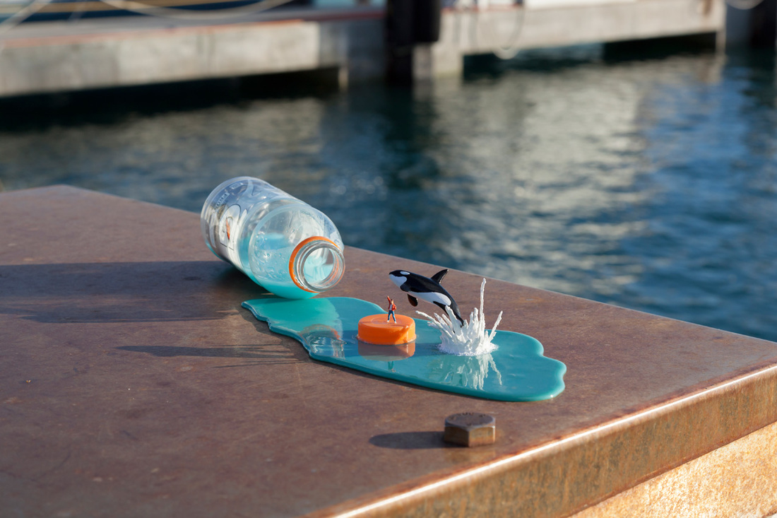
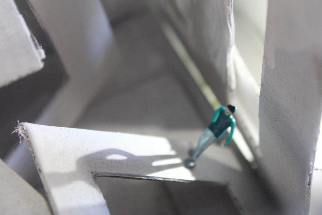
This is my favorite Slinkachu piece. I believe this composition works really well as it focuses on the figures, however, in the background, we can see that it is near water which complies to the story of the image. Also, after researching this composition, I found that it was made in Honolulu at a whale watching company's boat which makes the story more interesting. I also believe that this image tells a story of the orca, and the water bottle represents that the captivity in which they are kept. Slinkachu may have done this to raise awareness of the cruel conditions they face and how, although the model is small, the problem can be big. This can also be a representation of the film "Free Willy" where the boy helps the orca break free from captivity. In the larger image at the top, the very shallow depth of field works well as it makes you focus on the boy and the orca, which could be a way of Slinkachu representing that we need to focus on the problem orcas face today.
Matthew Albanese...

|

|
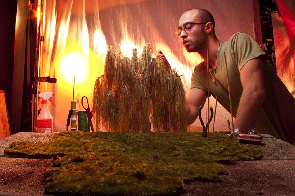
Matthew Albanese had a strong fascination for special effects, film designs and illusions throughout the most of his life. This is shown through his work as he uses miniature set ups, like Slinkachu, however he uses it to make it seem real, unlike Slinkachu who uses his art to show that people are missing the reality of things on a larger scale. I admire his work and I aspire to make my work like his by trying to make scenes that are realistic. I am also extremely interested in his use of lighting to create a certain which is shown in his pieces, New Life 1 and New Life 2, to create mood and atmosphere and I believe this would help with my work if I tried to do something similar. On the other hand, I would like to make my photos more meaningful and have a message that will affect people, like Slinkachu.

|
|
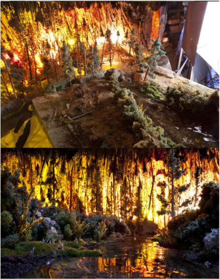
The two photos above are other examples of Matthew Albanese's which inspire me within my work. I believe his way of using lights to show emotions in the photo is very effective, to demonstrate what I mean by this, look at the photo on the right, the atmosphere is extremely chaotic due to the lighting which is used to resemble fire. I would thoroughly enjoy using lighting to demonstrate an emotion or mood within the photo and I plan to do this in future shoots.
Tezi GaBunia...

Tezi Gabunia created this surreal photography of models being a part of the artwork in models of different famous art galleries including the Saatchi, Gagosian, Tate and Louvre. The artist developed the Tate Modern Gallery first, he made a remodel of inside the building and made it come to life by having an exhibition of the model and allowing the public to be photographed inside the "exhibition". I believe the concept of this project is much like Slinkachu's work as he uses larger models on a smaller scale to create meaning within a photograph, whereas, Slinkachu uses miniature figures on a larger scale. I really like this artist as he shows a creative difference to what other artists similar to Slinkachu do.
Alice Bartlett...
Alice Bartlett made the idea of having a 'world at her fingertips' come to life when she began a project where she painted her nails a grass like effect and glued miniature train set figures to her nails and making it seem like a park of some sort. I really like how she used her hands in the compositions to present how small they really are. This is similar to Tezi Gabunia's creation of the art galleries. Both artists use humans to show how we are bigger than we seem and we affect more than we know.


First Photo Shoot...


Worst Photograph...
|
really do not like this photo from the shoot! I don't believe that the aperture was right as I originally wanted the foreground to only be in focus and the background to be almost completely out of focus however, I didn't check beforehand and the result was most of the photograph being in focus. I made this mistake a few times in the photo shoot, but once I started getting used to using the camera more and more, I corrected myself and managed to get some photos that I really liked. In addition to this, although I thought of a story for this photograph, it wasn't clear in the picture. I wanted to create a scene where the lion was breaking out of captivity to be free, which was also inspired by Slinkachu's work with the orca, however, the area wasn't right to do this. Also, this photo has a very blue tone which I really didn't like.
|

|
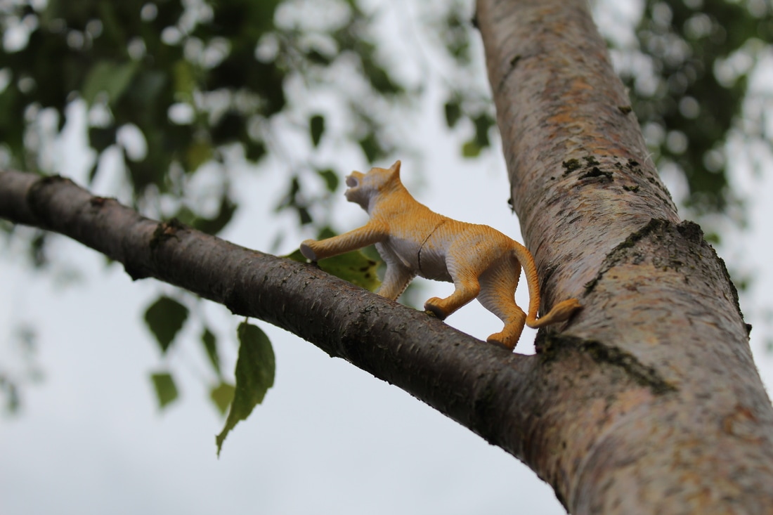
Best photograph...

|
In my opinion, this is the best photo of the shoot. I decided to use the branch of a tree to create an image of a female lion walking up the tree. I done this as I wanted to show that females can be strong alone and can still archive things. I also wanted to incorporate the tree as it is often around a lions natural habitat which I believe added to the effect of the photo, to make it more believable. I also really like the positioning of the leaf as it shows the size comparison between the figure and its surroundings. This could represent how although women are growing independence, we are still made to feel small in society and lesser than the things around us. Additionally, the angle of this shot is very powerful as we are looking up to the tree and the lion to present how we can be looking up to the future when women are equal to men, this presenting the journey that it is going to take to get there.
|

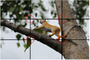
In this photo, I successfully used the compositional rule of triangles. As I tried to use triangles in my composition, I used a tree and placed a lion on it so I had a triangle with the lion in focus (blue), which would be the main place I want people to notice as that is where most of the story lays. I also made another triangle which was slightly less in focus (green) which shows the setting of the composition more than the first triangle. Another triangle was completely out of focus (orange) as it had no relevance to the image I was trying to create and didn't add to the composition. |
In addition to this, I used the compositional rule of thirds as I used the tree on two power spots, seen above, to make the photograph more professional; I also used a leaf in another power spot which added to the look of the photo. During the shoot, I wanted to make sure I included this rule and apply it to my work, as I wanted the photo to look more natural, by making the tree slightly off centre, therefore I used a grid on the camera to make sure it was in the right place.
|
Second Photo Shoot...


Worst photograph...
|
I think that this is my worst photo from the shoot because it doesn't tell a story and non of the figures are used as characters which doesn't show my creative potential. As well as this I do not think I used the right aperture for the image I was trying to create. I wanted only one Slinkachu figure in the focus point, so I should have used a larger aperture. In later photos, I corrected my mistake by checking the aperture of every photo to make sure it shown what I wanted it to. I also thought more about why I was taking the photos and what image I wanted to create. |

|
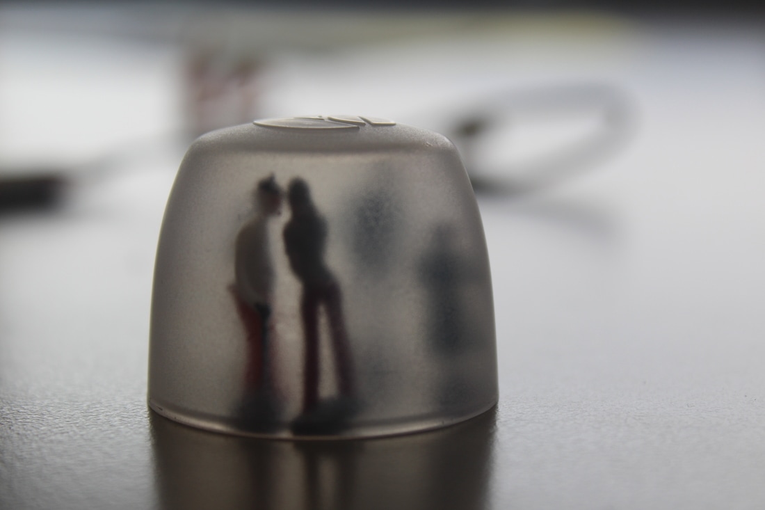
Best photograph...

My personal favourite photo.
|
In comparison to my worst photo, I believe that this was the best photo from the shoot from the shoot because it was very unique and different and wasn't something that I had seen done before, and telling a story. The image shows a 'hidden couple' leaning to kiss one another, which I used to represent how affection in public is frowned upon. I felt like this could be a very powerful message. I also think the aperture was perfect in this image as I used a large aperture, I used f5.6 so that the focus point was on the figures in the foreground whereas the background is extremely out of focus. In addition to this, the exposure was correct for the image I was trying to create, for example, in other photos the figures were more visible but I wanted to create the message that the couple were hiding from the rest of the world so the use of a silhouette helped to achieve what I was trying to show. I also think this photo, combined with the photo on the right, fit together perfectly and tell the story behind the image. However, I felt like the larger image was better as it focused better on the figures and it was much clearer. I also used figures with very bright clothes to make a slight coloured shadow. I chose a woman wearing red trousers as red is typically stereotyped with romance and love which was what I wanted to resemble in the photo. In this photo, I also used the compositional rule of thirds. This is shown as one of the two figures visible in the shot is in between two power spots, as well as the deodorant cap being almost along a line. This was done to make my photograph more powerful and professional. Another compositional rule used in this shoot was the rule of triangles. I placed my figures at an angle to try to create a triangle effect showing the two figures kissing which I believe helped my photographic skills develop further.
|

My second favourite photo.

Rule of Triangles.

Rule of Thirds.
|
Fifth Shoot.
Planning.
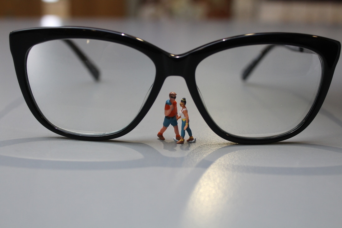
In this shoot, I wanted to show a comparison between big and small and to do this, I decided to use an average everyday item to represent something that its not. After thinking about different things I could use for the shoot, I had the idea of using a pair of glasses as a bridge with a man and a woman walking towards each other. After taking a few photos using this concept, the photos looked quite good, however, I decided to change it so that the man and woman were walking towards each other through the lens of the glasses as I thought that the angle of the images would be quite unique. After doing this, I decided to go back to the idea of the glasses being a bridge as I really liked my original idea, however, I moved the miniature figures to underneath the 'bridge' leaning towards one another to represent intimacy and show that the figures were a couple.
The Shoot.


Worst Photo.

|
I believe that this is my worst image as it is the least focused of the images. Although I like the concept of the composition, I do not think that this photo reaches my creative capability.
|
Best Photograph.

I feel that this is one of my best photos as I really like how central the figures are as it really draws your attention to their relationship. Additionally, the lighting I used added to the photo as the white lighting makes the photo seem calm and comfortable, as white can have connotations of peace and present a calm atmosphere. This lighting also allowed me to create shadows of both the glasses and the figures in the shot. In the shot, I preferred the aperture and depth of field than some of my other shots as the background was completely out of focus, as well as behind the lenses. If I were to recreate this shoot, I would use a white background to draw more attention to the figures instead of the colours in the background. Despite this, I am happy with the outcome of this shoot.
Third Photo-Shoot.
Planning.
In this photo-shoot, I wanted to create a 'maze' of discovery. I decided to use a piece of work made of white cardboard and strings, that weaves in and out of itself. I wanted my photographs to resemble how difficult it can be for a person to find themselves and love themselves. In most photos I used only one Slinkachu figure to show how, although it is a lonely, confusing path, it can only be done on your own. In addition to this, part way through the shoot I added lighting to cast long shadows to resemble how a person can be bigger than what they appear when they realise themselves. I used the white cardboard and a white light to resemble how innocent everything is in the mind of people, and a figure with coloured clothes to show that humans are the only thing that can change the 'black and white' attitude of society, which is what I believe my photographs could influence people to do as well as discover themselves as an individual. I also took a lot more photos than I had in all my other photo-shoots to try to get the perfect picture.


Worst photograph.
|
This is one of the worst photos of the shoot. Although I liked the angle of the photo, the cardboard maze got in the way of the camera which made the image look less professional. As well as this, the light was too bright so you could not see the shadows of the photo, this made it difficult to show what the photo was supposed to resemble. In addition to this, the positioning of the Slinkachu figure was not perfect for the image in my mind, as it was quite a messy scene, therefore, I moved the figure into a slightly different place and added lighting.
|

|
Best Photograph.

This is one of my best photos from the shoot. Although I found it difficult to choose between photographs in this shoot, as I liked a lot of them due to my progression in photography skills and the inclusion of compositional rules and features, I think that this one had the most potential to demonstrate what I wanted to symbolise within the shoot. In my opinion, he looks like he is lost and the shadows cast from him are leading the way to his self discovery, which will then put his soul or shadow back into his body in order for him to be happy in himself. I also believe that this photograph shows great creative skill, as I used the shoot to show something which I believe needs to be addressed and is very unique. In the shoot, I used a manual focus and focus points to make sure the photo was right, and although this went wrong a few times in the shoot, I quickly corrected my mistakes and progressed into creating the perfect shot.
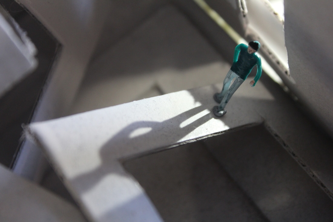
Fourth Photo-Shoot.


Worst Photograph.
Worst photo.
|
This is the worst photo of this shoot as I accidentally put my finger in the way of the lens, However, I really like the angle of the composition, as well as including the compositional rule of thirds. Therefore, I recreated this shot and was careful to make sure I moved my hand away. I quite liked how my composition turned out, despite this, the story was not very interesting therefore, I left it behind and continued with the shoot, but I decided to incorporate different ideas.
|
Improvement.
|
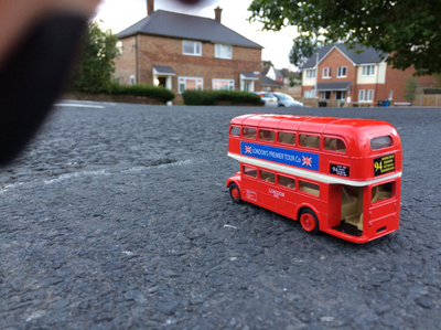
Best Photograph.

I believe that this is one of the best photos of the shoot; this is because the angle of the shot is very different in comparison to my other shots. I also like the way the bus is 'driving' into the shot
Final Shoot.
Planning My Final Shoot.
|
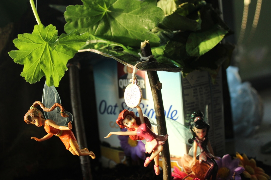
For my final shoot, I wanted to create something different that would stand out. I decided on using a scene from a movie; Tinkerbell and the Great Fairy Rescue, with Tinkerbell figures I had as a child. I wanted to create the fairy house from in the movie as I felt like it had the most photographic and creative potential. I wanted to make this scene in animation become a reality as it was something that I had always been interested in. To do this, I will need to use a lot of different materials to build the house successfully. As well as making the house, I am going to make a little bridge out of cardboard and a sign saying "fairies welcome". I plan on doing this shoot in an area with a similar atmosphere as in the film.
|


My inspiration for my final shoot.
|
Creating Props.
I decided that I was going to make the whole fairy house myself. To begin this process, I used an old oatmeal box to make it look as much like the original image. I then used leaves as the roof, however, some of these got broken or died, therefore, I decided to place fake leaves in places where gaps had formed. I also make a door with small twigs, a piece of cardboard and a fake flower. This was a long process creating this house, nevertheless, I was pleased with the outcome of it as it was very realistic and worked really well for my shoot.


Photo-shoot.


Worst Photo.
|
This is one of the worst photos of the shoot, as it is overexposed, the photograph is flooded by the bright sunlight coming from the window.
|
|
Best Photographs.
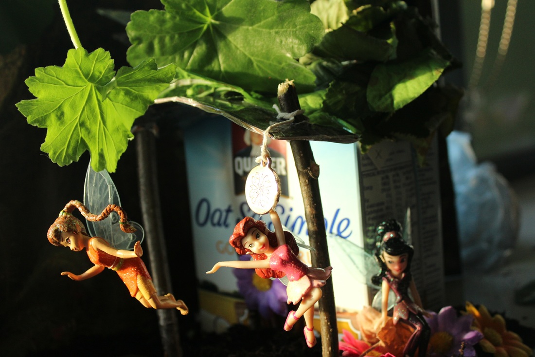
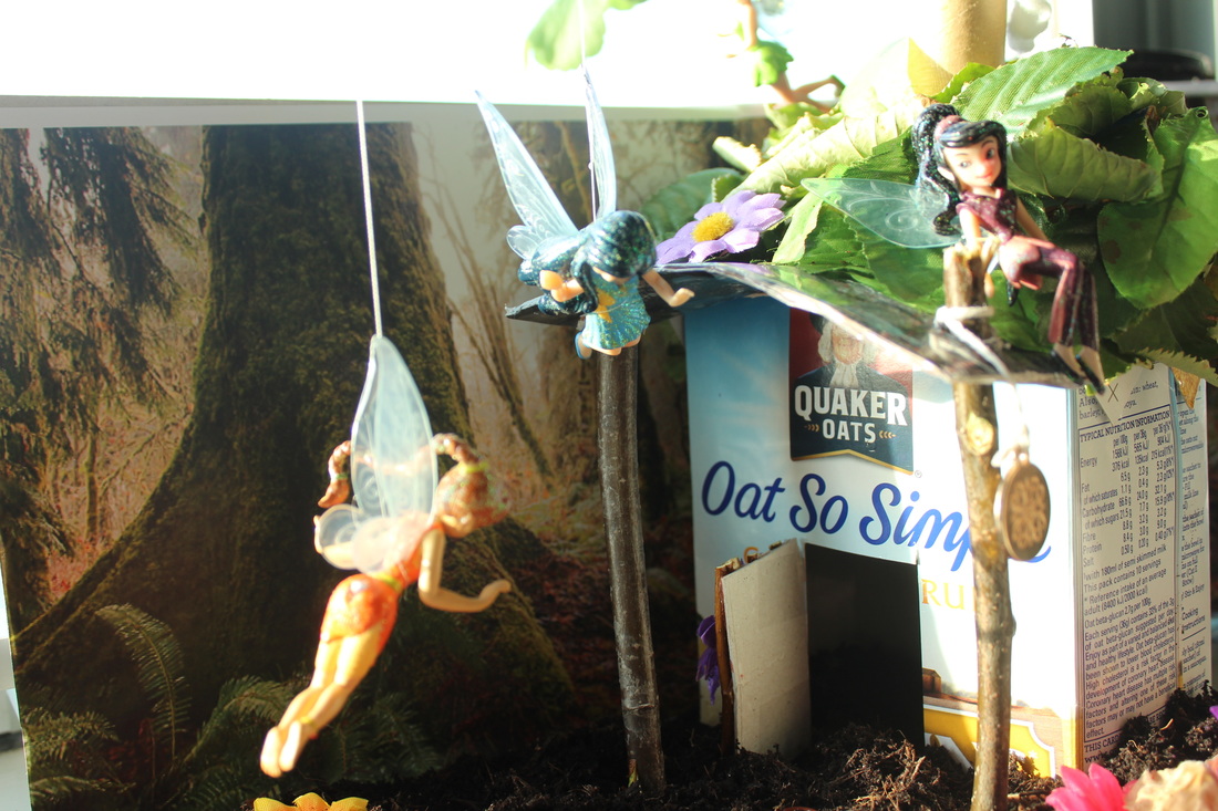
This is my favourite photo from the shoot as I believe that it was most successful picture with the allusion of the fairies flying and shows the story of the fairies in the fairy-house extremely well. Additionally, in the shoot, many of the photos are overexposed, however, as it got further into the shoot, it started going darker which gave me perfect lighting for the image I wanted to create. The way the light shone through the leaf created quite a magical element to the composition which improved the photo. Although I had a lot of difficulty making the figures look like they are flying, I managed to use a thin piece of string and wrapped it around the stem of a plant so it wasn't obvious in the picture. As well as this, I used the compositional rule of thirds to make the image much stronger and more appealing to look at, I chose to do this by placing the house in line with power spots as well as putting two of the fairy's on or close to power spots.
Slinkachu Evaluation.
My Best Photos.